
PERFECTLY IMPERFECT COUNSELING SERVICES · THERAPIST WEBSITE CASE STUDY
A Website That Sounds Like Jennifer and Speaks to the Women She Wants to Reach
Client: Jennifer Brown, Perfectly Imperfect Counseling Services
Project: Brand strategy, website messaging, and website design
Website: perfectlyimperfectonline.com
Jennifer had been practicing for seven years. She knew the women she connected with, how she worked with them, and the feeling she wanted them to have when they met her. Her website wasn’t communicating all of that.
The photos felt posed. The copy didn’t sound like her. And the previous approach to her site had put design ahead of the deeper question: What does a potential client need to recognize, understand, and trust before reaching out?
We began by finding the answer to that question. Then we built a website around it.
The Starting Point: A Practice That Had Grown Beyond Its Website
Jennifer wasn’t starting from scratch. She had a practice, an existing website, and a strong sense that her online presence no longer represented the work she was doing.
She wanted potential clients to feel warmth and trust—to think, This is somebody I can talk to. She also wanted the site to show more of her personality. The existing photos were polished, but they didn’t give visitors much sense of the person they would meet in therapy.
There was a messaging challenge, too. Jennifer works with Black women navigating anxiety, overthinking, burnout, expectations, and the pressure to keep everything together. She was certain about that connection, yet understandably wondered whether naming her audience so clearly might make other women feel unwelcome.
At the same time, she wanted to reach women before everything reached a breaking point. Her site needed to speak to the woman who is still managing work, relationships, and responsibilities, but can feel that the way she’s been coping is taking a toll.
Phase 1:
Finding the Throughline
In our strategy work, we looked past a list of services and therapy methods to understand what it actually feels like to work with Jennifer—and what her clients may be experiencing before they know what kind of help to search for.
Three decisions shaped the direction.
STEP 1
Lead with the women Jennifer most wants to reach
Jennifer had worked with Black women throughout her practice. Once we named that audience clearly, the site could speak with greater specificity: to women who look capable from the outside while privately carrying anxiety, guilt, exhaustion, or the weight of being the first in their families to do certain things.
That choice gave the messaging a point of view. Other women can still see themselves in Jennifer’s work; the site simply begins with the people she feels especially called to serve.
STEP 2
Describe the experience before explaining the methods
Jennifer brings approaches such as IFS, somatic work, breathwork, and movement into her practice. Those details matter. But a prospective client may arrive at her site thinking, Why can’t I turn my brain off? or Why do I feel guilty every time I rest?
We made room for those questions first. The strategy was to help a visitor recognize her own experience, then show how Jennifer approaches the work. That gives Jennifer’s methods context instead of asking visitors to interpret a list of clinical terms on their own.
STEP 3
Let Jennifer’s warmth and directness come through
Jennifer wanted the brand to feel bold and welcoming. She liked the energy of her existing pink, so the direction wasn’t to erase it. We paired that boldness with softer colors, more natural lifestyle photography, and language that sounds closer to a conversation with Jennifer.
By the end of Phase 1, Jennifer had a direction she could recognize as her own. She wrote that the homepage, colors, and core language felt aligned with her and the vision she was moving toward. She was ready to talk about building the full site.
Phase 2:
Therapist Website Case Study: How Jennifer’s Site Took Shape
A strong message only helps if visitors can find their way through it. During the website build, each page had a job: help someone see herself in the content, understand Jennifer’s approach, and know what to do next.
The homepage makes the connection quickly
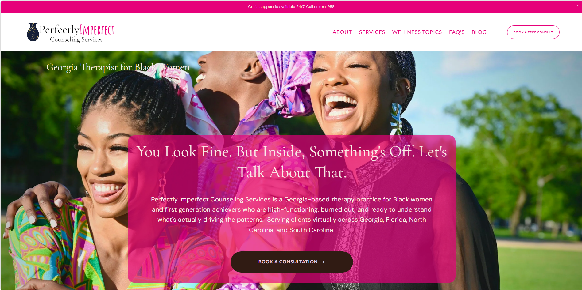
The homepage identifies Jennifer as a Georgia therapist for Black women, then opens with an experience many of her prospective clients know well: looking fine on the outside while feeling that something is off inside.
Further down, the copy gets more specific about thoughts that won’t turn off, exhaustion other people don’t see, and guilt around resting. These are the kinds of moments someone might recognize in herself long before she knows whether to search for “somatic therapy” or “IFS.”

The page then introduces Jennifer in a warmer, more personal voice, explains the ways to work with her, and lays out three simple steps for getting started. A visitor can see that reaching out begins with a conversation and that she and Jennifer will decide together whether it’s a fit.
The service page shows what therapy with Jennifer could look like
The Individual Therapy page goes beyond naming what Jennifer treats. It describes the woman who seems to have it together while feeling close to falling apart, gives concrete examples of what she may be carrying, and walks through the process from consultation to ongoing work.
That matters for someone who is considering therapy and wondering what will happen after she clicks “contact.” Jennifer’s approach becomes easier to picture: the conversation, the patterns they may explore, and the work of carrying what she learns into everyday life.
The topic pages meet visitors at a more specific moment
On the Anxiety and Overthinking page, the entry point is a familiar experience: a brain that won’t stop running. The page moves from the everyday signs of overthinking to the patterns beneath them, then explains how Jennifer works with clients on those concerns.
That structure lets a visitor follow her own question through the page: Is this what I’m dealing with? Does Jennifer understand it? What would working together involve? From there, she has a path to the appropriate service.
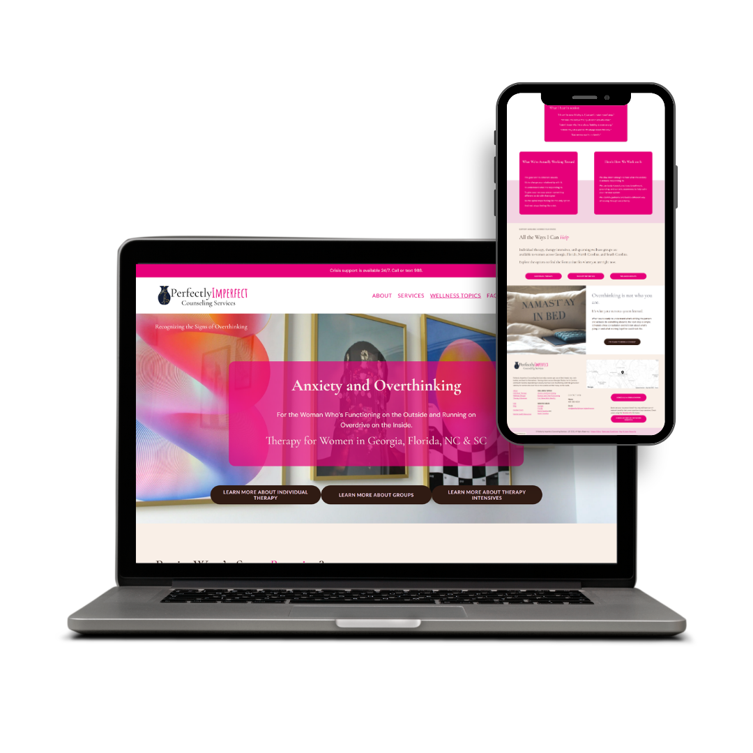
The site also makes space for the direction Jennifer wants her practice to grow. Individual therapy is available now; groups and intensives are presented as upcoming offerings rather than services a visitor can book today.

Jennifer’s reaction to the completed pages was immediate: “You are spot on with every page and every word!”
In her testimonial, she described the result this way:
“For the first time in seven years, I feel I have a cohesive brand strategy and website that communicates who I serve, what I offer, and what makes my practice unique while focusing on the client.”
Later, Jennifer shared that requests had been coming in steadily from people she considers ideal clients. She said prospective clients told her the site sounded as though it was speaking directly to them; one said it sounded like Jennifer had written a description of her.
That is the outcome we were working toward: a website where Jennifer can recognize herself, and where the right visitors can recognize their own experiences well enough to take the next step.
What Jennifer Said After Launch
Jennifer Brown, LCSW
Perfectly Imperfect Counseling Services
Is Your Website Showing People What It’s Like to Work With You?
If your practice has grown but your website still feels a step behind, we can start by getting clear on the people you want to reach, the experience you offer, and the words that connect the two.